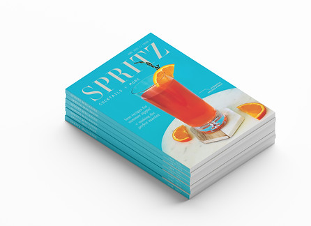
Spritz Magazine
Client
Personal Project
Deliverables
Magazine of 10+ Pages
Goals
Create a Magazine for Young Cocktail Enthusiasts
Produce Beautiful Imagery that Inspires Interest
Prioritize Readability for Recipes + Articles
My Roles
Research articles to include, create photography to match, photo editing and color correction, and create a brand identity that is easily recognizable.
About Spritz
Spritz Magazine is a magazine that inspires the inner bartender in us all, providing easy recipes, interesting articles, and tips and tricks to impress your friends and improve any cocktail. Spritz is targeted toward a younger crowd, 21–45, but the beautiful photography can catch the eye no matter what age.
Branding
After solidifying a name, goals, and target market, the next step was creating the logo and moodboard. Then would come creating the color scheme that would guide the photography and create unity through the magazine.
Moodboard
Spritz Magazine was inspired by beautiful yet simplistic photography, as well as bright, bold, vibrant pops of color that match or contrast the beverages to be displayed on each page.

Moodboard for Spritz Magazine
Logo
The Spritz logo is simple, using a modern typeface and one of several bright colors, especially orange or blue. The tagline "Cocktails + More" describe the content inside the magazine but still evoke curiosity to learn more through purchase.
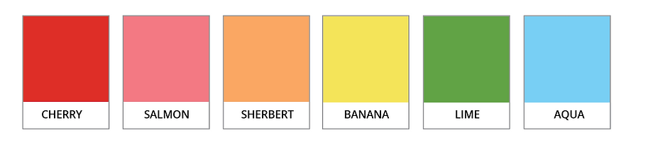
Color Scheme
To set the tone and guide the rest of the magazine, I chose a few colors from the first photography shoots for the magazine and compiled some colors to repeat throughout the pages.

Typefaces
As I designed my pages, I eventually settled on these typefaces. Included was my barely used modern Spritz Logo typeface, my easy to read san serif body, and a combination of a blocky, sharp typeface with accents of a decorative script for my titles.
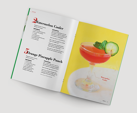
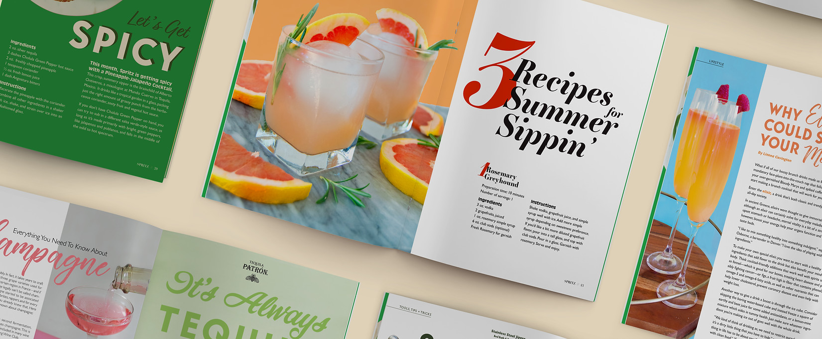
Articles + Photography
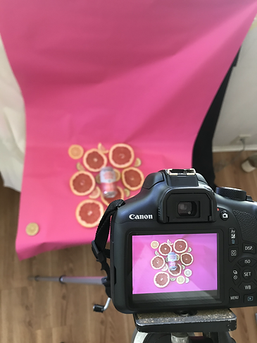
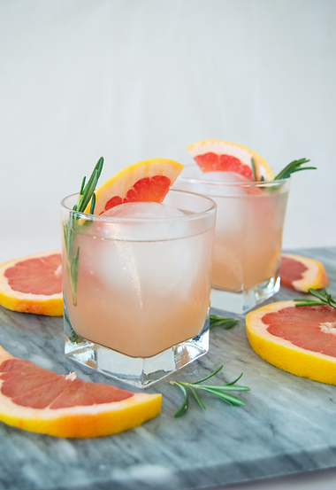
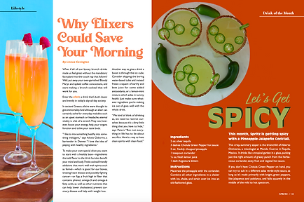
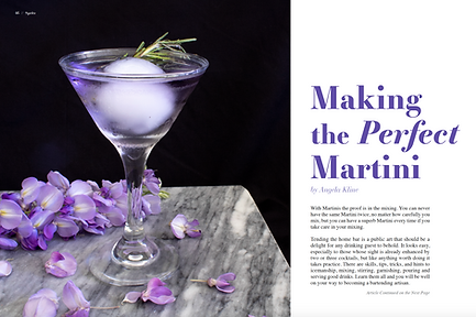
Articles and recipes were selected from the internet and credit was given to sources. I took all my own photography, which included set design, creating cocktails, editing photos and colors and creating transparent elements. While more work, I felt I could control every aspect of the magazine this way, especially the colors and overall vibe.
Photography
See the images below to see the photo shoots in action, along with the finished edited photo.


Articles
Articles and recipes were selected completely based on how well I felt I could execute the images to accompany them. This depended on numerous factors (Did I have the right glass for this cocktail, fresh fruit that matched, a background that would highlight it, enough to make the photo dynamic?) Additionally, I chose cocktails whose colors would reflect the general color palette of the magazine and would match well with each other.
Iterations


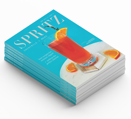
Product Mockups